Today, We will learn how to create bootstrap buttons. We will use Bootstrap custom button styles for actions in forms, dialogs, and more. Includes support for a handful of contextual variations, sizes, states, and more. Read more: How to create Bootstrap Jumbotron and where to use
When using button classes on <a> elements that are used to trigger in-page functionality (like collapsing content), rather than linking to new pages or sections within the current page, these links should be given a role=”button” to appropriately convey their purpose to assistive technologies such as screen readers.
<!DOCTYPE html>
<html lang="en">
<head>
<title>Bootstrap Example</title>
<meta charset="utf-8">
<meta name="viewport" content="width=device-width, initial-scale=1">
<link rel="stylesheet" href="https://maxcdn.bootstrapcdn.com/bootstrap/4.5.2/css/bootstrap.min.css">
<script src="https://ajax.googleapis.com/ajax/libs/jquery/3.5.1/jquery.min.js"></script>
<script src="https://cdnjs.cloudflare.com/ajax/libs/popper.js/1.16.0/umd/popper.min.js"></script>
<script src="https://maxcdn.bootstrapcdn.com/bootstrap/4.5.2/js/bootstrap.min.js"></script>
</head>
<body>
<div class="container">
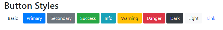
<h2>Button Styles</h2>
<button type="button" class="btn">Basic</button>
<button type="button" class="btn btn-primary">Primary</button>
<button type="button" class="btn btn-secondary">Secondary</button>
<button type="button" class="btn btn-success">Success</button>
<button type="button" class="btn btn-info">Info</button>
<button type="button" class="btn btn-warning">Warning</button>
<button type="button" class="btn btn-danger">Danger</button>
<button type="button" class="btn btn-dark">Dark</button>
<button type="button" class="btn btn-light">Light</button>
<button type="button" class="btn btn-link">Link</button>
</div>
</body>
</html>
The button classes can be used on <a>, <button>, or <input> elements:
<a href="#" class="btn btn-info" role="button">Link Button</a>
<button type="button" class="btn btn-info">Button</button>
<input type="button" class="btn btn-info" value="Input Button">
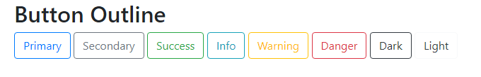
<input type="submit" class="btn btn-info" value="Submit Button">Bootstrap Button Outline
Bootstrap 4 provides eight outline/bordered buttons:
<!DOCTYPE html>
<html lang="en">
<head>
  <title>Bootstrap Example</title>
  <meta charset="utf-8">
  <meta name="viewport" content="width=device-width, initial-scale=1">
  <link rel="stylesheet" href="https://maxcdn.bootstrapcdn.com/bootstrap/4.5.2/css/bootstrap.min.css">
  <script src="https://ajax.googleapis.com/ajax/libs/jquery/3.5.1/jquery.min.js"></script>
  <script src="https://cdnjs.cloudflare.com/ajax/libs/popper.js/1.16.0/umd/popper.min.js"></script>
  <script src="https://maxcdn.bootstrapcdn.com/bootstrap/4.5.2/js/bootstrap.min.js"></script>
</head>
<body>

<div class="container">
  <h2>Button Outline</h2>
  <button type="button" class="btn btn-outline-primary">Primary</button>
  <button type="button" class="btn btn-outline-secondary">Secondary</button>
  <button type="button" class="btn btn-outline-success">Success</button>
  <button type="button" class="btn btn-outline-info">Info</button>
  <button type="button" class="btn btn-outline-warning">Warning</button>
  <button type="button" class="btn btn-outline-danger">Danger</button>
  <button type="button" class="btn btn-outline-dark">Dark</button>
  <button type="button" class="btn btn-outline-light text-dark">Light</button>
</div>

</body>
</html>
Bootstrap Button Sizes
Use the .btn-lg class for large buttons or .btn-sm class for small buttons:
<button type="button" class="btn btn-primary btn-lg">Large</button>
<button type="button" class="btn btn-primary">Default</button>
<button type="button" class="btn btn-primary btn-sm">Small</button>
Bootstrap Active/Disabled Buttons
A button can be set to an active (appear pressed) or a disabled (unclickable) state:
The class .active makes a button appear pressed, and the disabled the attribute makes a button unclickable. Note that <a> elements do not support the disabled attribute and must therefore use the .disabled class to make it visually appear disabled.
<button type="button" class="btn btn-primary active">Active Primary</button>
<button type="button" class="btn btn-primary" disabled>Disabled Primary</button>
<a href="#" class="btn btn-primary disabled">Disabled Link</a>
Bootstrap Spinner Buttons
You can also add “spinners” to a button
<!DOCTYPE html>
<html>
<head>
  <title>Bootstrap Example</title>
  <meta name="viewport" content="width=device-width, initial-scale=1">
  <link rel="stylesheet" href="https://maxcdn.bootstrapcdn.com/bootstrap/4.5.2/css/bootstrap.min.css">
  <script src="https://ajax.googleapis.com/ajax/libs/jquery/3.5.1/jquery.min.js"></script>
  <script src="https://cdnjs.cloudflare.com/ajax/libs/popper.js/1.16.0/umd/popper.min.js"></script>
  <script src="https://maxcdn.bootstrapcdn.com/bootstrap/4.5.2/js/bootstrap.min.js"></script>
</head>
<body>

<div class="container">
  <h2>Spinner Buttons</h2>
  <p>Add spinners to buttons:</p>

  <button class="btn btn-primary">
    <span class="spinner-border spinner-border-sm"></span>
  </button>

  <button class="btn btn-primary">
    <span class="spinner-border spinner-border-sm"></span>
    Loading..
  </button>

  <button class="btn btn-primary" disabled>
    <span class="spinner-border spinner-border-sm"></span>
    Loading..
  </button>

  <button class="btn btn-primary" disabled>
    <span class="spinner-grow spinner-grow-sm"></span>
    Loading..
  </button>
</div>

</body>
</html>
1 thought on “How to create bootstrap buttons”