Today, We will learn what is a bootstrap container and will also see the example to understand the use of HTML. Read: How to create Bootstrap Jumbotron and where to use
Creating Containers with Bootstrap
Containers are the most basic layout element in Bootstrap and are required when using the grid system. Containers are basically used to wrap content with some padding. They are also used to align the content horizontally center on the page in case of the fixed-width layout.
Bootstrap provides three different types containers:
.container, which has a max-width at each responsive breakpoint..container-fluid, which has 100% width at all breakpoints..container-{breakpoint}, which has 100% width until the specified breakpoint.
The table below illustrates how each container’s max-width changes across each breakpoint.
For example, when using the .container class the actual width of the container will be 100% if the viewport width is <576px, 540px if the viewport width is ≥576px but <768px, 720px if the viewport width is ≥768px but <992px, 960px if the viewport width is ≥992px but <1200px, 1140px if the viewport width is ≥1200px but <1400px, and 1320px if the viewport width is ≥1400px.
Similarly, when you use the .container-lg class the actual width of the container will be 100% until the viewport width is <992px, 960px if the viewport width is ≥992px but <1200px, 1140px if the viewport width ≥1200px but <1400px, and 1320px if the viewport width is ≥1400px.
Containers are used to pad the content inside of them, and there are two container classes available:
- The
.containerclass provides a responsive fixed width container - The
.container-fluidclass provides a full width container, spanning the entire width of the viewport
| ClassesBootstrap Grid System | X-Small<576px | Small≥576px | Medium≥768px | Large≥992px | X-Large≥1200px | XX-Large≥1400px |
|---|---|---|---|---|---|---|
.container | 100% | 540px | 720px | 960px | 1140px | 1320px |
.container-sm | 100% | 540px | 720px | 960px | 1140px | 1320px |
.container-md | 100% | 100% | 720px | 960px | 1140px | 1320px |
.container-lg | 100% | 100% | 100% | 960px | 1140px | 1320px |
.container-xl | 100% | 100% | 100% | 100% | 1140px | 1320px |
.container-xxl | 100% | 100% | 100% | 100% | 100% | 1320px |
.container-fluid | 100% | 100% | 100% | 100% | 100% | 100% |
Also Read: What are Bootstrap Containers and how to code
Let’s have few example of bootstrap containers
<!DOCTYPE html>
<html lang="en">
<head>
<meta charset="utf-8">
<meta name="viewport" content="width=device-width, initial-scale=1">
<title>Set Paddings and Margins to Bootstrap Containers</title>
<link href="https://cdn.jsdelivr.net/npm/bootstrap@5.0.2/dist/css/bootstrap.min.css" rel="stylesheet">
<script src="https://cdn.jsdelivr.net/npm/bootstrap@5.0.2/dist/js/bootstrap.bundle.min.js"></script>
</head>
<body>
    <!-- Container with border, extra paddings and margins -->
    <div class="container border py-3 my-3">
        <h1>This is a heading</h1>
        <p>This is a paragraph of text.</p>
    </div>
    <p class="m-3"><strong>Note:</strong> The classes ".py-3", and ".my-3" are <a href="/twitter-bootstrap-tutorial/bootstrap-helper-classes.php" target="_top">spacing utility classes</a> to add padding, and margin of 1rem to the top and bottom sides of the element, respectively.</p>
</body>
</html>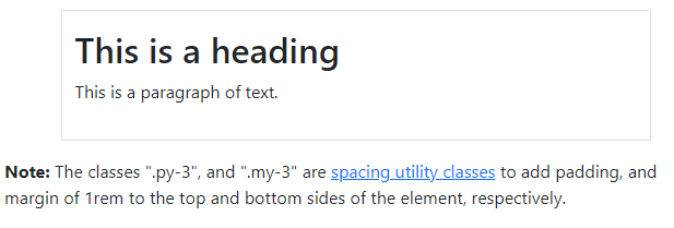
0 thoughts on “What is Bootstrap Container and How to use in HTML”