Today, We will learn how to write code for Bootstrap Images. Read also: What are Bootstrap Colors and How to Code
While creating a bootstrap page, We usually include images to the page. Here we will see how the images can be formatted in bootstrap. This could be a rounded corner image, circle-shaped image, thumbnail image, alignment of the image, and responsive image.
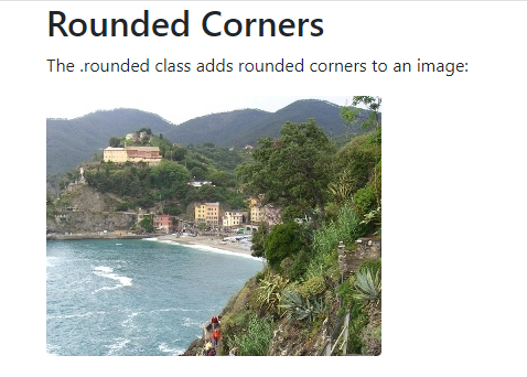
Bootstrap Rounded Corners image
The class .rounded adds rounded corners to an image:
<!DOCTYPE html>
<html lang="en">
<head>
  <title>Bootstrap Example</title>
  <meta charset="utf-8">
  <meta name="viewport" content="width=device-width, initial-scale=1">
  <link rel="stylesheet" href="https://maxcdn.bootstrapcdn.com/bootstrap/4.5.2/css/bootstrap.min.css">
  <script src="https://ajax.googleapis.com/ajax/libs/jquery/3.5.1/jquery.min.js"></script>
  <script src="https://cdnjs.cloudflare.com/ajax/libs/popper.js/1.16.0/umd/popper.min.js"></script>
  <script src="https://maxcdn.bootstrapcdn.com/bootstrap/4.5.2/js/bootstrap.min.js"></script>
</head>
<body>

<div class="container">
  <h2>Rounded Corners</h2>
  <p>The .rounded class adds rounded corners to an image:</p>
  <img src="cinqueterre.jpg" class="rounded" alt="Cinque Terre" width="304" height="236">
</div>

</body>
</html>
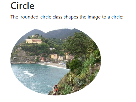
Bootstrap Circle image
The class .rounded-circle shapes the image to a circle:
<!DOCTYPE html>
<html lang="en">
<head>
  <title>Bootstrap Example</title>
  <meta charset="utf-8">
  <meta name="viewport" content="width=device-width, initial-scale=1">
  <link rel="stylesheet" href="https://maxcdn.bootstrapcdn.com/bootstrap/4.5.2/css/bootstrap.min.css">
  <script src="https://ajax.googleapis.com/ajax/libs/jquery/3.5.1/jquery.min.js"></script>
  <script src="https://cdnjs.cloudflare.com/ajax/libs/popper.js/1.16.0/umd/popper.min.js"></script>
  <script src="https://maxcdn.bootstrapcdn.com/bootstrap/4.5.2/js/bootstrap.min.js"></script>
</head>
<body>

<div class="container">
  <h2>Circle</h2>
  <p>The .rounded-circle class shapes the image to a circle:</p>
  <img src="cinqueterre.jpg" class="rounded-circle" alt="Cinque Terre" width="304" height="236">
</div>

</body>
</html>
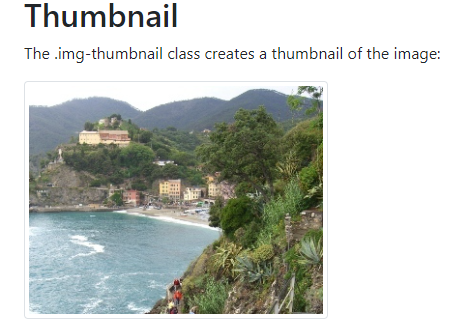
Bootstrap Thumbnail image
The class .img-thumbnail shapes the image to a thumbnail (bordered):
<!DOCTYPE html>
<html lang="en">
<head>
  <title>Bootstrap Example</title>
  <meta charset="utf-8">
  <meta name="viewport" content="width=device-width, initial-scale=1">
  <link rel="stylesheet" href="https://maxcdn.bootstrapcdn.com/bootstrap/4.5.2/css/bootstrap.min.css">
  <script src="https://ajax.googleapis.com/ajax/libs/jquery/3.5.1/jquery.min.js"></script>
  <script src="https://cdnjs.cloudflare.com/ajax/libs/popper.js/1.16.0/umd/popper.min.js"></script>
  <script src="https://maxcdn.bootstrapcdn.com/bootstrap/4.5.2/js/bootstrap.min.js"></script>
</head>
<body>

<div class="container">
  <h2>Thumbnail</h2>
  <p>The .img-thumbnail class creates a thumbnail of the image:</p>
  <img src="cinqueterre.jpg" class="img-thumbnail" alt="Cinque Terre" width="304" height="236">
</div>

</body>
</html>
Bootstrap Aligning Images
Float an image to the right with the class .float-right or to the left with .float-left:
<!DOCTYPE html>
<html lang="en">
<head>
  <title>Bootstrap Example</title>
  <meta charset="utf-8">
  <meta name="viewport" content="width=device-width, initial-scale=1">
  <link rel="stylesheet" href="https://maxcdn.bootstrapcdn.com/bootstrap/4.5.2/css/bootstrap.min.css">
  <script src="https://ajax.googleapis.com/ajax/libs/jquery/3.5.1/jquery.min.js"></script>
  <script src="https://cdnjs.cloudflare.com/ajax/libs/popper.js/1.16.0/umd/popper.min.js"></script>
  <script src="https://maxcdn.bootstrapcdn.com/bootstrap/4.5.2/js/bootstrap.min.js"></script>
</head>
<body>

<div class="container">
  <h2>Aligning images</h2>
  <p>Use the float classes to float the image to the left or to the right:</p>
  <img src="paris.jpg" class="float-left" alt="Paris" width="304" height="236">
  <img src="paris.jpg" class="float-right" alt="Paris" width="304" height="236">
</div>

</body>
</html>

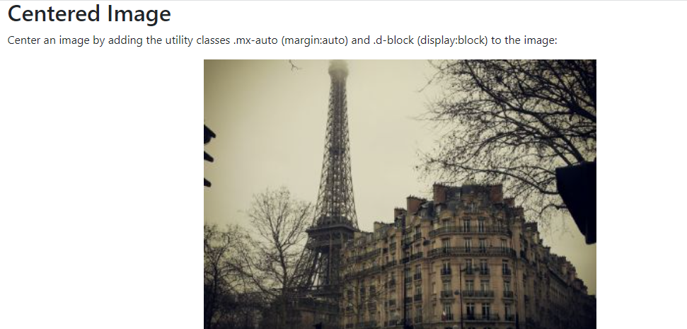
Bootstrap Centered Image
Center an image by adding the utility classes .mx-auto (margin:auto) and .d-block (display:block) to the image:
<!DOCTYPE html>
<html lang="en">
<head>
  <title>Bootstrap Example</title>
  <meta charset="utf-8">
  <meta name="viewport" content="width=device-width, initial-scale=1">
  <link rel="stylesheet" href="https://maxcdn.bootstrapcdn.com/bootstrap/4.5.2/css/bootstrap.min.css">
  <script src="https://ajax.googleapis.com/ajax/libs/jquery/3.5.1/jquery.min.js"></script>
  <script src="https://cdnjs.cloudflare.com/ajax/libs/popper.js/1.16.0/umd/popper.min.js"></script>
  <script src="https://maxcdn.bootstrapcdn.com/bootstrap/4.5.2/js/bootstrap.min.js"></script>
</head>
<body>

<div class="container">
  <h2>Centered Image</h2>
  <p>Center an image by adding the utility classes .mx-auto (margin:auto) and .d-block (display:block) to the image:</p>
  <img src="paris.jpg" class="mx-auto d-block" style="width:50%">
</div>

</body>
</html>
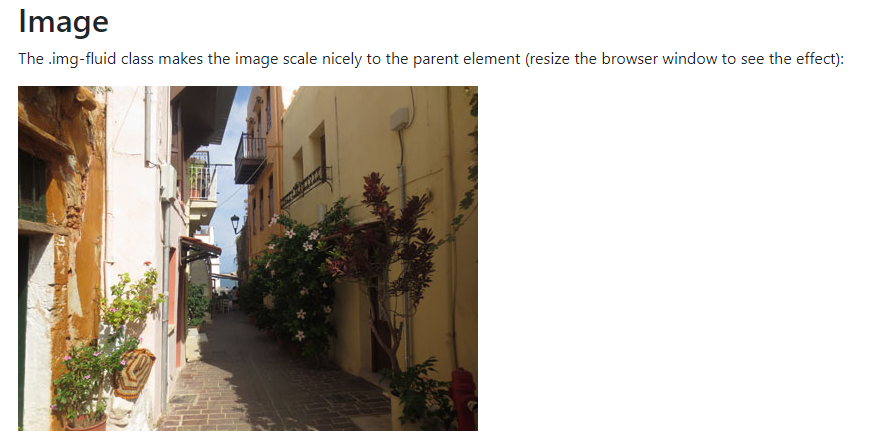
Bootstrap Responsive Images
Images come in all sizes. So do screens. Responsive images automatically adjust to fit the size of the screen.
Create responsive images by adding a class .img-fluid to the <img> tag. The image will then scale nicely to the parent element.
The .img-fluid class applies max-width: 100%; and height: auto; to the image:
<!DOCTYPE html>
<html lang="en">
<head>
  <title>Bootstrap Example</title>
  <meta charset="utf-8">
  <meta name="viewport" content="width=device-width, initial-scale=1">
  <link rel="stylesheet" href="https://maxcdn.bootstrapcdn.com/bootstrap/4.5.2/css/bootstrap.min.css">
  <script src="https://ajax.googleapis.com/ajax/libs/jquery/3.5.1/jquery.min.js"></script>
  <script src="https://cdnjs.cloudflare.com/ajax/libs/popper.js/1.16.0/umd/popper.min.js"></script>
  <script src="https://maxcdn.bootstrapcdn.com/bootstrap/4.5.2/js/bootstrap.min.js"></script>
</head>
<body>

<div class="container">
  <h2>Image</h2>
  <p>The .img-fluid class makes the image scale nicely to the parent element (resize the browser window to see the effect):</p>
  <img class="img-fluid" src="img_chania.jpg" alt="Chania" width="460" height="345">
</div>

</body>
</html>
Read also: What are Bootstrap Tables and How to create
1 thought on “How to write code Bootstrap Image”